
Kids Foot Locker
Expanding the vibrant in-store shopping experience to the e-commerce platform

CHALLENGE
In the B2C segment, e-commerce is fast becoming the preferred mode of shopping with amazing convenience, great prices, faster deliveries and super responsive customer care centres. Footlocker wanted to improve the web shopping experience for their customers.
The current in-store brand experience was extremely playful and modern, while the online shopping experience felt dated. With this project, Footlocker aimed at bridging the gap between the two to create a more seamless experience.
CLIENT
Kids Foot Locker via Deloitte Digital
DURATION
9 Months
TEAM
Avantika Agrawal, Ravi Joshi, Nisha Mehta
TOOLS
Interviews, Axure and Sketch App for wireframes, Invision for user testing


Tablet Shopping Experience

Mobile Shopping Experience
The Big Question
How might we expand the playful shopping experience of Kids Foot Locker stores into the online shopping experience?
Our Design Process

Heuristic Analysis
EXISTING DESIGN
PROPOSED INTERVENTION
IA AND NAVIGATION
Contains a deep and broad navigation structure
Progressive and streamlined IA and navigation
NUMBER OF CLICKS
Currently the user is at least 3 clicks away to reach the list page
Maximum two clicks to product list page
One click to buy option
CAROUSEL
1% clicked feature, of those, 87% were the first position. - nd.edu stats by @erunyon
Use of muse video for spotlight content followed by dynamic cards
COLOR PALLETE
Use of excessive colors creating visual complexity and leading to loss of brand identity
Reflective use of primary and secondary palette to create a visually pleasing layout
TYPOGRAPHY
Lack of rhythm and hierarchy in content details which creates clutter and disharmony
Create type hierarchy with the use of 2 fonts and extended neutral palette
PAGINATION
Enforces a click to view more products
Dynamic loading of product list
ACCESSIBILITY
Needs more consideration for special users by adhering to ADA standards
Use of audio and image search to ADA, AA standards
Brainstorming
As part of our brainstorming activity, we called in multiple users of the current Foot Locker site and asked them to create post-its with their desired image of the brand. We then used affinity mapping to understand what the issues were. We divided them into Ideas and Issues. This was then converted to a word cloud.


Users
EXPLORER

Loves exploring a variety of products
Navigation pattern may vary
Makes a buying decision on various parameters (user ratings, popularity etc.)
A kid can be a potential explorer
Due to longer browse times might use tablet/desktop more

INFORMED
Directly types in the keyword
Typical navigation pattern
Most of the time the buying decision is made
A parent can be a potential informed user
Mostly accessed on mobile due to quick usage
Design Approach
Based on our brainstorming sessions, we came up with a design approach that was presented to the entire stakeholder team. This helped us get feedback on our design ideas before we actually built them, and helped save a lot of rework.

MOBILE FIRST
A new approach to planning, UX Design and development that puts hand held devices at the forefront of both strategy and implementation
Mobile devices are now the primary means by which users access web content, and the number of people using sites on mobile devices is supposed to triple within the next year
A step towards responsive design

PROGRESSIVE DISCLOSURE
A design pattern to display advanced functionalities as the user interacts with it
An interaction design technique often used in human computer interaction to help maintain the focus
Helps reduce clutter, confusion and cognitive workload
Helps achieve minimalistic design
ICON-IC STYLE
'An icon is worth a thousand words'
Use of icons instead of long text makes the website aesthetically pleasing
Use of images reduces cognitive load
Icons are designed for recognitions

CARD/TILE APPROACH
The use of cards in the UI is an excellent metaphor since they look like real world tangible cards eg. business cards
Cards divide content into meaningful sections which occupies less screen space
Card based design usually relies heavily on visuals, and images act as a strength
Good option for responsive design since cards act as content containers that can easily scale up or down
SCROLL IS THE NEW CLICK
Scrolling is natural and the most efficient way of scanning for content of interest
Faster and convenient
Allows us to highlight our content in an fluid, directed motion

MATERIAL MOTION
Describe function and intention with beauty and fluidity
Inspired from real world forces and motion
Smooth and guided transitions which help focus better
Micro interactions to acknowledge user inputs

Wireframes


Home page
Product List Page
Product Details Page
Checkout Flow


Home page
Product List Page
Product Details Page
Checkout Flow
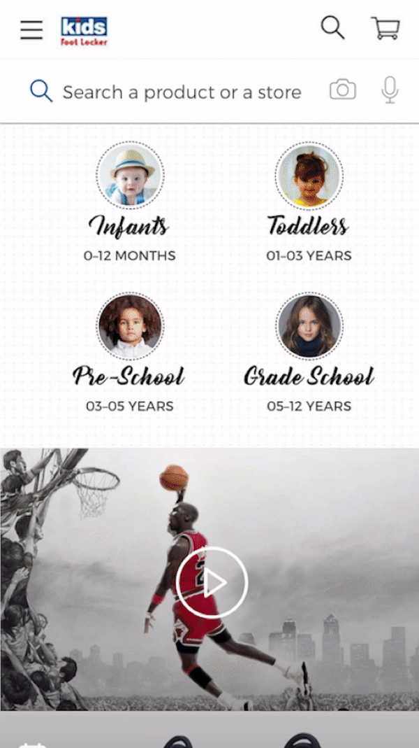
Final Designs
Our final designs were a cumulation of all the feedback we received in our design approach. We focused on creating a colourful playful experience for the app, while at the same time maintaining usability.
HOMEPAGE


PRODUCT LIST PAGE


PRODUCT DETAILS PAGE
